Remote controls
By jacobo, on 2005-12-15 at 16:15, under General
<tongue location="cheek">
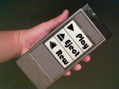
These two are GNOME and KDE, according to GNOME people:
This is GNOME, according to me (KDE user):

</tongue>
<tongue location="cheek">
These two are GNOME and KDE, according to GNOME people:
This is GNOME, according to me (KDE user):

</tongue>
Sorry, the comment form is closed at this time.
it would be nice to know what you think is missing in gnome. otherwise i’ll label this entry as uninformed fud.
You can label this entry as a joke, Anonymous Coward.
I think the original picture is a poor metaphor for the usability argument and I hope it is swiftly forgotten. What it suggests is functionality not provided by the blessed interface will not be provided at all. If this is the case, I’ll be jumping ship.
As a GNOME user, I must say that is the funniest thing I’ve saw in a long time. Congrats! :D
I’m a gnome user too. And yes, it’s funny… :)
I don’t really like toying with my desktop & appearances if everything is ok. So why bother?
Ya’ll are lame because you use GUIs… I curse the intarwebs, which force me to count myself among your lame ranks.
ratpoison forever!!!
The gnome picture has a couple things wrong with it. For one, there needs to be a keyboard on fire plummeting off a large tall building in the background, symbolizing how GNOME decided to burn the bridges with people who actually use computers and decided they just want to be known as the simple pretty easy to use environment and forsake the actual linux users who like configuring stuff. How bout a beefy remote control car with big red & green STOP / GO button on a remote? Go work for MS you cowbell lovers! I guess Apple would be more apt, what with the evangelical “we know whats best” thing they’ve got going on.
Yeah, your human interface work has been off the charts. Good job! Unfortunately, it still feels like premature optimization. Where are these linux using ludites needing reduced interface? Yes, I understand; chicken, egg, if we build it they will come, but it just seems foolish to do such heavyhanded reductionalism. Thats not a word, is it?
The desktop war will not be won by better environments. It will be won by new ways to monitor, shift and control our data and information. On the other hand, GTK is swank, and thank you for that. And GNOME really is doing a fantastic job, one day when linux does start going commodity it will become massively useful, so keep it up. If its your bag, just keep hacking kids. Do whatcha love, right.
PS I own three ATI RF Remotes which are just rebadged ones of the big ones above. :( I guess that shows where I’m from. I even use the bastard to control my laptop when its in my bag. It was a mild upgrade from the ps2 controller. Kindly, there is no channel lock: hit a button on any remote and any USB adapter in the area will pick it up. That actually happens to be insanely useful. If only my logitech keyboards could do that. Otoh, the pad is 8 way digital and the range is shite.
And I dont like ipod’s condescending as crap interface either. Mass storage mp3 devices or bust, wh00!
All this goes to show that you should most definately ignore my dirty punk ass. ;-]
It’s too funny !